Choosing your wedding colors
The first thing your guests will notice when they enter your wedding reception—and maybe even the moment they receive the invitation—is the color palette. Whether you opt for a pared-down white and cream or a bright orange, the hue you choose has the power to set the mood of the entire event. It’s a big design hurdle that dictates much of the rest of the decor—once you settle on a scheme, other elements like florals and centerpieces naturally fall into place. If you’re finding yourself lost in a sea of Pinterest boards and paint swatches, take a deep breath and follow these tips.
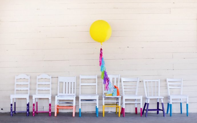
Think Beyond Neutrals
Gone are the days when it was customary to start with a neutral color palette and maybe add just one or two pops of color. Mindy Weiss, Wedding Paper Divas style partner and celebrity wedding planner, says that while whites, creams, or beiges with soft accents like blush or peach yield that classic “dreamy bridal look, ” many brides are opting for a bolder scheme. There is no wrong answer, but don’t assume that you must go the neutral route just because it’s a wedding.
Brainstorm
Weiss advises couples to close their eyes and envision their wedding—not their best friend’s wedding or the standard all-white affair, but their wedding. Of course, think about color, but also, what does it feel like? What music is playing? What food is being served? What words come to mind to describe the scene? All of this free association can help conjure color ideas.
Consider the Message You Want to Send
Many couples think of a color scheme simply as reception decor, but the impact actually starts before people even RSVP. Your guests will likely first see your scheme when they receive your save-the-date—and the colors on that little piece of paper will hint at what they can expect on the big day. A classic ecru and gold scheme nods to formality, while orange card stock with white hand lettering says they’re in for something more unexpected.
Let Nature Be Your Guide
If you’re looking for some help narrowing your focus, consider what flowers will be in season when you walk down the aisle. While you can get pretty much any blooms year-round, it’s much more affordable (and eco-friendly) to go with seasonal stems. While a summer wedding will have the pick of the litter (think: a roomful of blush peonies), fall nuptials might be best served by an abundance of wine-stained dahlias.
Look Around for Inspiration
You probably already have a million pins on Pinterest and some color ideas floating around in your head, but if you’re still not sure, look for inspiration in less obvious places. Flip through your parents’ wedding album (or, better yet, your grandparents’ photos); pick up a few non-wedding design magazines; look in your closet and check what colors pop up the most; riff off of the hues native to your favorite vacation destination; or pick the chakra color that most resonates with you and go for a tonal scheme.
Get Creative With Color Use
If you’re set on incorporating bright pink in your wedding but don’t want a Barbie princess party, be strategic: Opt for a mostly neutral scheme and add the hot pop of color in a neon sign, a couple of blooms in each bouquet, or as the calligraphy on the menus. Just because you have a color in your scheme doesn’t mean it needs to be splashed all over.
Remember, a “Color Scheme” Can Be Broad
Choosing a scheme doesn’t have to be limiting or rigid. Some couples bring Pantone chips with them to make every flower, linen, and lighting decision, but you should feel free to be a bit loose with your picks. Rather than a specific list of “cream, sea-foam green, and gold, ” perhaps you’re after a “colorful spring vibe.” If you’re not set on specific hues, just provide a few pictures (non-wedding images are fine!) that illustrate the feeling you’re going for so vendors can get on the same page. And a more fluid approach to color might be the best way to go; according to Weiss, not everything should coordinate perfectly: “Being too matchy-matchy can give off a high school prom vibe.”


